For years, clients and partners have asked us: “Why Silver Mouse?” It’s a question we’re always happy to answer, and now, as we celebrate our 11th anniversary, we’re excited to share the story behind our name and unveil our refreshed logo.
When we started in 2014, we sought a name that was both memorable and relevant to our digital marketing focus. We gravitated towards a combination of a color and an animal. “Silver” was chosen over “gold” for its sophisticated connotation of money, avoiding a potentially gaudy association. “Mouse” was a natural fit, representing the essential tool of the computer and internet, the very foundation of our digital work.
Essentially, “Silver Mouse” embodies our mission: helping businesses (and ourselves) leverage the internet to drive growth and revenue. A good brand name, we believe, should be concise and easy to pronounce, and “Silver Mouse” ticks all those boxes.
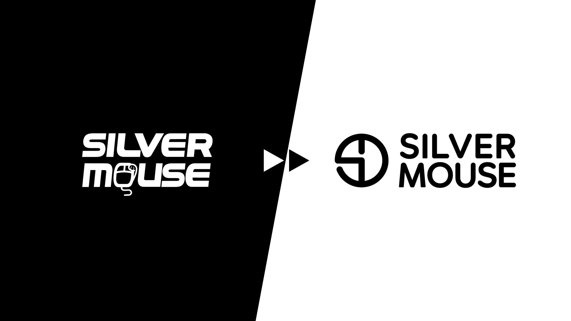
Our original logo, featuring a maneki-neko morphed into a keyboard mouse, served us well. However, as we evolved, we felt it was time for a change. The font felt dated, and the icon, while creative, lacked the minimalist elegance we now desired.

This week, as we celebrate our 11th anniversary, we’re thrilled to introduce our new logo. We aimed for a design that reflects our growth: purposeful, robust, and professional. The new icon, a simple yet elegant combination of “S” and “M,” embodies our refined approach. Additionally, the icon subtly echoes the shape of a keyboard mouse—can you see it?
You can download our new logo in various formats—black and white, horizontal and vertical—below.
- Silver Mouse Logo – Black Horizontal
- Silver Mouse Logo – Black Vertical
- Silver Mouse Logo – White Horizontal
- Silver Mouse Logo – White Vertical
As we embark on this new chapter, we remain committed to providing top-notch digital marketing and creative services. Reach out to us, and let’s explore how we can help your business thrive in the digital landscape.


